
![[infographic] Responsive web design: hot tips to getting it right](/themes/savvy_bootstrap/img/upload/images/dreamstime_s_33701272%281%29.jpg)
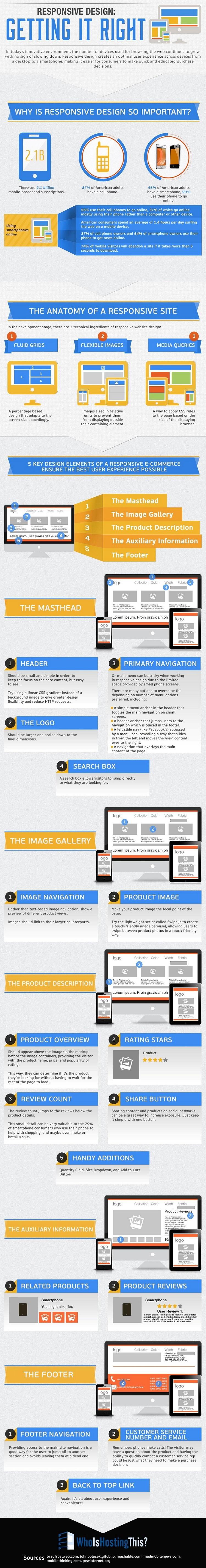
With more than 2.1 billion mobile broadband subscribers as potential customers, making sure your website is designed to meet the ever-evolving needs is critical. According to research illustrated by whoishostingthis in the infographic below, people are becoming increasingly frustrated with sites that don’t display correctly: for example 74% of mobile visitors will abandon a site if it takes more than five seconds to download.
Responsive web design is about providing the optimal user experience irrespective of whether they use a desktop computer, a smartphone, a tablet or a smart-TV. E-commerce platforms in particular have seen the impact that progressive and forward-thinking responsive design can have on a company and its growth. It’s about keeping the features visitors want and none of the things they don’t. The ‘less is more’ approach is more relevant than ever with responsive design, with little room for heavy graphics, confusing navigation or pages locked into desktop-only resolutions.
So if your company hasn't yet considered using responsive web design, you will most likely be losing visitors who are browsing your website from a smart phone (and many will be). Therefore it is essential to restructure your website to be device friendly and optimized to meet this technology which is always in a rapid usage increase.
If you are selling products or services online it is especially critical to make sure you have these five elements:
- a masthead
- an image gallery
- product descriptions
- auxiliary information
- and a footer.
For details on these elements, check out the infographic below:

At Microcosm, we deliver a total communications solution for busy retailers. From the ever-changing world of web, e-commerce and social media, to important traditional print sales catalogues and direct mail. A total solution means your brand is taken to market in a clear, effective and visible way. We empower you with the right tools and help influence potential and current customers both online and in store.
Do you need help with
web development?
There are 917 web developers on standby
Ananda Raj Pandey, Developer at ONETOUCH ACCOUNTING SOLUTIONS
Great article Suzie
Wendy Huang, Full Time Blogger and YouTuber at A Custom Blog in 4 Minutes
Makes it totally easy to understand thank you :)!